SORS Dev Log Part 2 – Pretty Pictures and Text Mountains
Thanks to our early demo releases, we’ve had some good feedback on SORS so far. One thing that’s become apparent is that a lot of people were skimming through the text in the game. The fools! How can they play a game and skim through the text! They’re obviously ‘noobz’.
I am joking, of course. You’ve probably heard the phrase ‘the customer’s always right’, and a similar phrase is true in game design – the player is ALWAYS right. Player got bored? Tough. Player skimmed text? Tough. Player quit? Tough. You (as the game designer) didn’t make that part of the game engaging enough.
Obviously people not reading text in the game is a problem, as in SORS the text conveys important game information and interesting science.
Take a look at the ‘before’ screenshot below from the game. It’s dull. Very dull. How did I not spot this whilst making the first demo? Well, when you’ve spent months creating something, you tend to lose a bit of perspective, which is why getting fresh faces to playtest is so important.

So how to fix this? I decided on two key things to make this text more engaging – modularise it, and add some nice pretty pictures/animations.
No walls of text
Walls of text are generally a bad idea. They put people off, instantly creating a daunting textual Kilimanjaro that the reader sees they have to climb. It’s why newspapers (and scientific papers) are written in columns. Games also tend to be text-light (unless they’re a text adventure or something similar).
However, they’re not always bad in games. If a player is emotionally invested in a game, they will gladly trawl through text. A good example is the original Alone in the Dark game. There were lots of books throughout the game that added to the atmosphere, filled in the backstory to the game and helped the player solve puzzles. Speaking from my experience of playing the game, I was certainly happy to read through this text because of these points.

Another example is BioWare’s Mass Effect series. There are lots of text-pads with background information on the game universe scattered around the game. They add depth and atmosphere to the game, but crucially are not obstructive – players don’t HAVE to read them in order to progress through the game.

In SORS we’ve adapted this principle of making background, informational text optional. Players will, however, have to read through game-relevant text before progressing. This seems like a sensible compromise. With important text, better to err on the side of caution and force the player to look at it, rather than risk the chance they miss it and become frustrated with the game when they’re not sure what to do. So how to make this text engaging?
Pretty moving pictures
It’s quite an obvious principle. It’s why seemingly all modern websites these days, especially for tech start-ups, generally have a video as the first thing users see on their website. Humans are lazy. Why read something when you can watch about it instead?
In SORS, videos would be nice, but actually working through the details reveals that gif-esque short animations accompanied by a short bit of text are just as effective, as well as being cheaper and easier to implement. These short clips mean that players can easily see what is meant by some game text, and how it relates to the game interface.
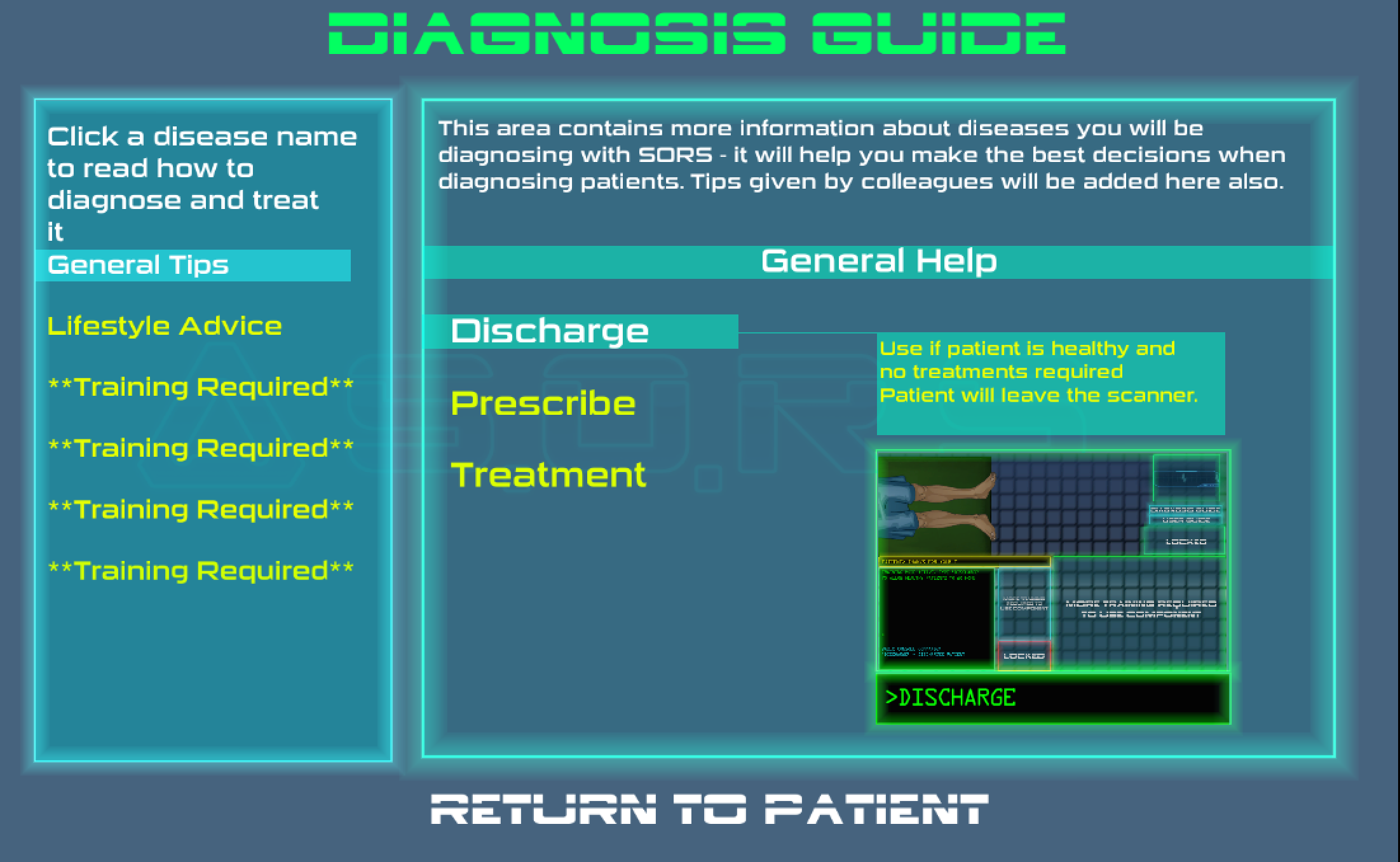
The general layout of text screens has also been addressed, to make it look more like a ‘futuristic’ UI console, whilst also separating the text out so that players aren’t presented with it all at once.
The current version of the same SORS screen shown initially is below. As you can see (and hopefully agree) it looks much neater, less daunting, and more helpful as it splits the text up and provides a short animation to help illustrate what is being said.
There will undoubtedly be further changes to come for many of the screens as play-testing and gathering feedback continues, but it feels like this is a step in the right direction for making the game engaging for players, whilst also offering them the chance to read more about the science in the game.